Gallery walls are personal, but the layout doesn’t have to be a mystery. This guide gives you clear measurements, spacing rules, and renter-friendly options so your wall looks intentional—not accidental. Use it for a sofa wall, a staircase run, or a small entry corner.
Top Picks / Fastest Wins
If you want the biggest “looks professional” upgrade with the least effort, start here:
- FastestPicture hanging kit (hooks + wire + anchors)
- No-drillRemovable picture hanging strips
- Clean linesCoordinated gallery frame set
- Pro trickPainter’s tape for mockups + crisp alignment
- Straight hangLaser level for grids and long runs
Table of Contents
- What a gallery wall is (and why it works)
- Sizing & fit rules (so it matches your furniture)
- Layout planning (floor mockups, templates, spacing)
- Frames, art, and what to avoid
- Hanging & hardware (renter-friendly included)
- Styling formulas by decor style
- Care, updates, and common mistakes
- Shop by room/zone
- Shop by constraint
- Amazon Shopping Links & Anchor Picks
- How we choose these picks
- FAQ
What a Gallery Wall Is (and Why It Works)
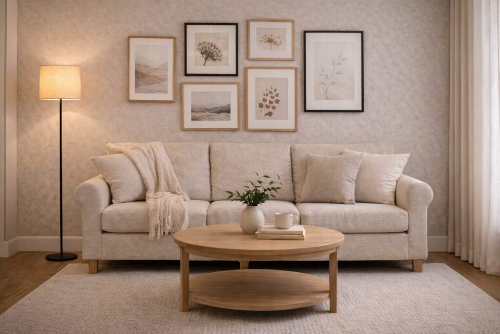
A gallery wall is a grouped arrangement of art, photos, and objects that reads as one visual statement. It works because it creates a focal point, adds scale, and can tie together colors and materials already in your room—especially on a sofa wall that needs structure.
Quick decision
- Best for: Adding a focal point on a sofa wall, stair run, or long hallway without buying one oversized piece.
- Avoid if: You need a super-minimal look and dislike visual variety (choose one large framed print instead).
- Size check: Treat the full group as one “art piece” and size it to your wall/furniture (rules in the next section).
Shop links (Amazon search)
Anchor product slots (placeholders)
- Budget: Basic frame multipack (budget anchor) (basic frame multipack)
- Best overall: Coordinated gallery frame set (best overall anchor) (coordinated gallery set)
- Premium: Solid wood frame set with matting (premium anchor) (solid wood frames + real matting)
Bundle add-on: Add a cohesive mat look in minutes with precut picture mat sets.
Style matcher
- Modern: Black/white frames, larger mats, fewer pieces with strong negative space.
- Warm Modern: Light oak frames, linen mats, soft curves (arched prints, organic abstracts).
- Luxury Modern: Deeper neutrals, thin brass accents, curated mix (photo + abstract + one texture piece).
Sizing & Fit Rules (So It Matches Your Furniture)
Most gallery walls look “off” for one reason: the group is the wrong size for what’s below it. Use these simple sizing rules for a sofa wall, console, or bed.
Quick decision
- Best for: Creating a balanced focal point that feels anchored to the furniture.
- Avoid if: Your furniture floats in the room with no clear wall behind it (focus on a different zone like an entry corner).
- Size check: Aim for the gallery wall to be about 2/3 the width of the furniture beneath it; keep the group visually centered.
Easy measurement checklist (sofa wall):
- Mark the sofa width. Multiply by ~0.66 to estimate ideal gallery width.
- Keep the bottom edge of the lowest frames roughly 4–6 inches above the sofa back (adjust for tall cushions).
- Plan your outer “bounding box” first, then fill in.
Shop links (Amazon search)
Anchor product slots (placeholders)
- Budget: Budget gallery frame multipack (width-building anchor) (simple multipack to hit your target width)
- Best overall: Mixed-size gallery frame set (best overall anchor) (set with a mix of medium + large sizes)
- Premium: Oversized centerpiece frame with mat (premium anchor) (oversized centerpiece frame + museum-style mat)
Bundle add-on: If your wall feels “floaty,” add one grounding piece (mirror or larger print) via arched wall mirror small.
Style matcher
- Modern: One large anchor frame + a tight set of smaller pieces with consistent matting.
- Warm Modern: Mix oak + black frames; add a soft abstract and one photo for warmth.
- Luxury Modern: Add a thin brass picture light look (or warm accent lamp nearby) and keep spacing precise.
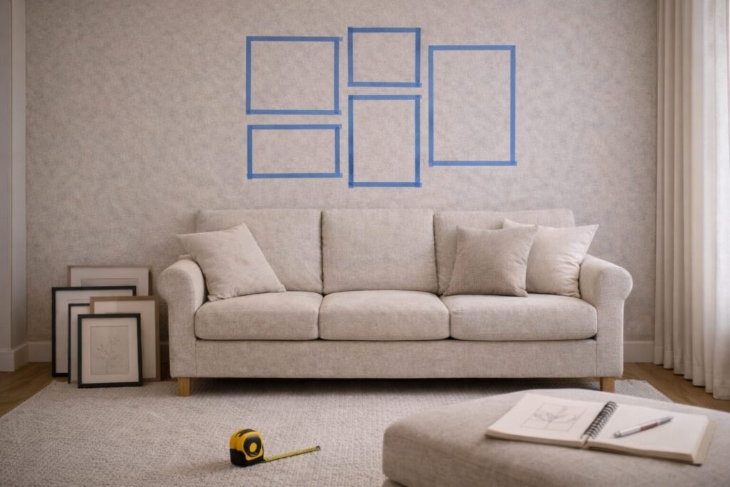
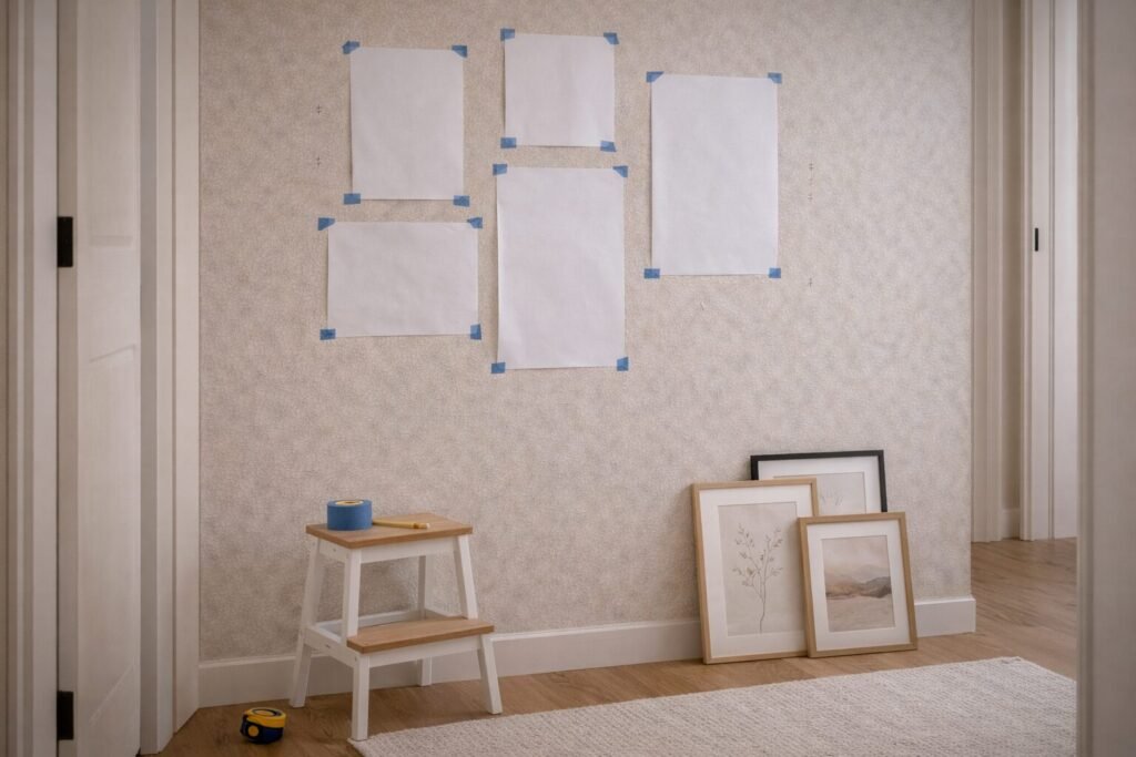
Layout Planning (Floor Mockups, Templates, Spacing)
Planning on the floor (or with paper templates) is the fastest way to get a balanced gallery wall—especially for a long hallway wall where crooked spacing shows instantly.
Quick decision
- Best for: Avoiding extra holes and getting consistent spacing on the first try.
- Avoid if: You don’t want to measure at all (choose a pre-arranged frame set instead).
- Size check: Keep 2–3 inches between frames for a crisp look; up to 4 inches if pieces are large.
3 layout options (pick one):
- Grid: Clean and modern; best with same-size frames.
- Row-based: Align top edges or center lines; easy above furniture.
- Organic cluster: Most forgiving; start with one anchor and build outward.
Shop links (Amazon search)
Anchor product slots (placeholders)
- Budget: Basic level + painter’s tape bundle (budget anchor) (basic level + tape bundle)
- Best overall: Laser level for gallery wall alignment (best overall anchor) (laser level for long hallway alignment)
- Premium: Professional layout + hanging tool kit (premium anchor) (professional layout tools + hanging kit)
Bundle add-on: For cleaner “gallery” spacing, use picture frame spacing tools.
Style matcher
- Modern: Grid layout; identical frames; strict spacing.
- Warm Modern: Row-based with mixed sizes; keep mats consistent.
- Luxury Modern: Organic cluster with one oversized anchor + curated negative space.
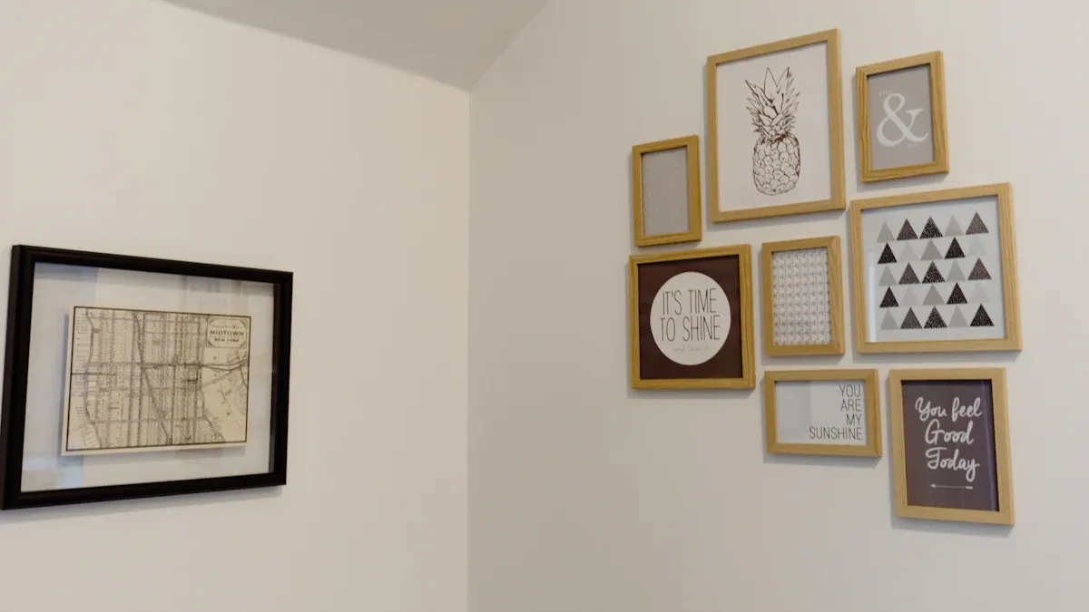
Frames, Art, and What to Avoid
The fastest path to a cohesive gallery wall is controlling frame finish, mat style, and color story. For a reading nook corner, softer pieces and smaller scale usually feel better than high-contrast, oversized art.
Quick decision
- Best for: Making mixed art feel intentional and “collected,” not random.
- Avoid if: You want maximum impact with minimum pieces (choose 1–2 large prints instead).
- Size check: Mix 2–3 sizes only (example: 8×10, 11×14, 16×20) to keep it visually calm.
What to avoid (common “cheap” tells):
- Too many frame finishes at once (pick 1–2).
- All tiny pieces spread too far apart (reads like clutter).
- Glossy, mismatched prints with no shared color thread.
Shop links (Amazon search)
Anchor product slots (placeholders)
- Budget: Neutral frame set with mats (budget anchor) (simple mats + neutral frame set)
- Best overall: Oak/black mixed frame set with mats (best overall anchor) (oak/black mix with consistent mat openings)
- Premium: Solid wood frames with museum-style mats (premium anchor) (museum-style mats + solid wood frames)
Bundle add-on: Tie everything together with a soft texture piece—search framed linen textured wall art.
Style matcher
- Modern: Black frames, white mats, graphic line art, fewer pieces.
- Warm Modern: Oak frames, creamy mats, organic abstracts, one personal photo.
- Luxury Modern: Deep charcoal accents, thin brass touches, curated photography + abstract.
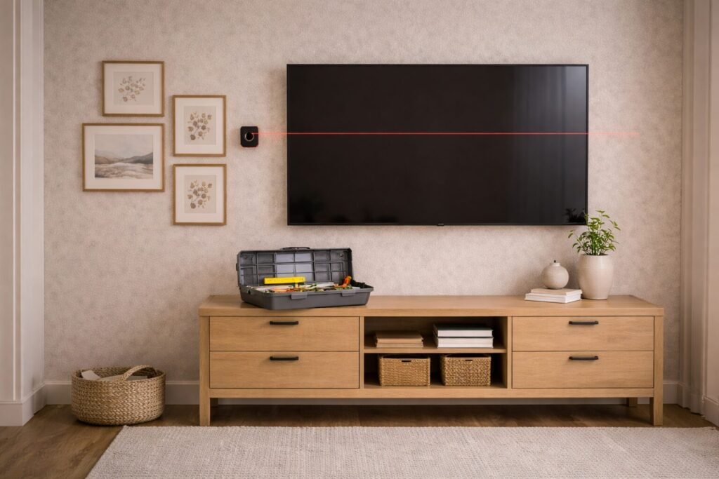
Hanging & Hardware (Renter-Friendly Included)
Hanging is where most gallery walls go sideways—literally. The good news: you can get a secure, straight install on a TV wall + media console using the right hardware and a simple marking routine.
Quick decision
- Best for: Straight, secure frames that don’t drift over time.
- Avoid if: You’re hanging heavy mirrors or large objects without proper anchors (use wall-rated hardware and studs).
- Size check: Heavier/larger frames need more stable hanging (two hooks, anchors, or stud placement).
Simple hanging sequence:
- Tape up paper templates (or mark corners lightly).
- Mark hanging points (center and/or wire height).
- Hang anchor piece first, then build outward.
- Use two points for larger frames to prevent swiveling.
Shop links (Amazon search)
Anchor product slots (placeholders)
- Budget: Picture hanging hooks assortment (budget anchor) (basic hooks + nails assortment)
- Best overall: Complete hanging kit with level (best overall anchor) (complete hanging kit + level)
- Premium: Laser level + heavy-duty anchors kit (premium anchor) (laser level + heavy-duty anchors)
Bundle add-on: Prevent frame shifting with picture frame bumpers.
Style matcher
- Modern: Tight grid beside or above a media console; keep lines crisp and parallel.
- Warm Modern: Add one woven/texture piece; keep the cluster balanced, not perfectly mirrored.
- Luxury Modern: Mix a matte black frame with a thin brass accent; keep spacing uniform.
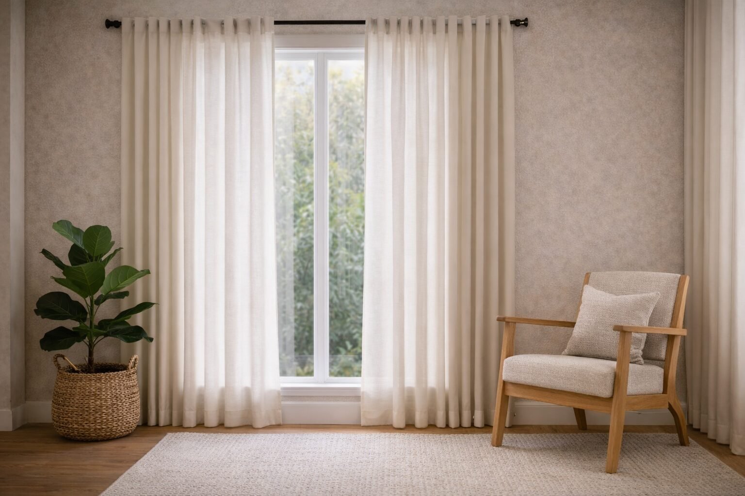
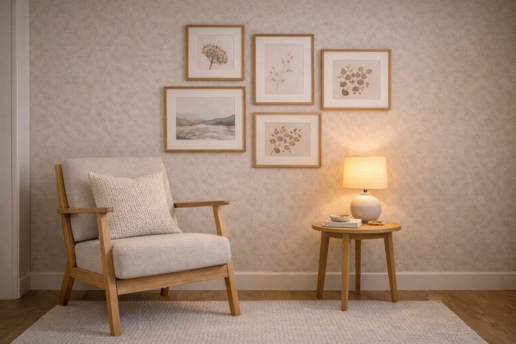
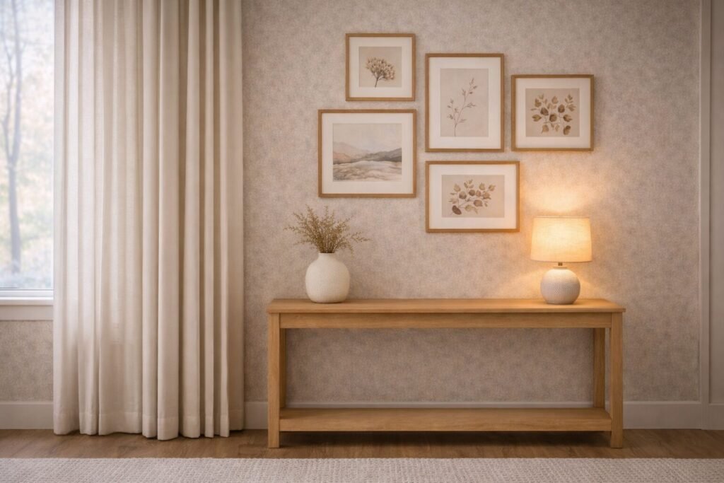
Styling Formulas by Decor Style
Once the frames are up, styling is about repeating shapes and controlling contrast. For a window/curtain wall, keep the gallery wall slightly tighter and let the curtains be the “soft volume” in the room.
Quick decision
- Best for: Making the wall feel cohesive with the rest of the room’s finishes.
- Avoid if: Your room already has many competing patterns (keep art quieter and mats consistent).
- Size check: Leave breathing room from trim/curtains; avoid crowding the window casing.
3 no-fail styling formulas:
- Modern: Black frames + white mats + 1 accent color repeated twice.
- Warm Modern: Oak frames + neutral mats + soft abstracts + one personal photo.
- Luxury Modern: Deeper neutrals + one brass/metal accent + curated negative space.
Shop links (Amazon search)
Anchor product slots (placeholders)
- Budget: Print set + basic frames (budget anchor) (print set + basic frames)
- Best overall: Warm-neutral gallery wall collection (best overall anchor) (cohesive warm-neutral collection)
- Premium: Fine-art style prints with matting (premium anchor) (fine-art style prints + upgraded matting)
Bundle add-on: Make the whole wall feel “designed” with linen-look ivory curtains (works especially well near a window/curtain wall).
Style matcher
- Modern: Keep art graphic and spacing consistent; avoid ornate frames.
- Warm Modern: Repeat light wood tones from furniture in the frames.
- Luxury Modern: Add one elevated material note (stone-look vase, brass candleholders nearby).
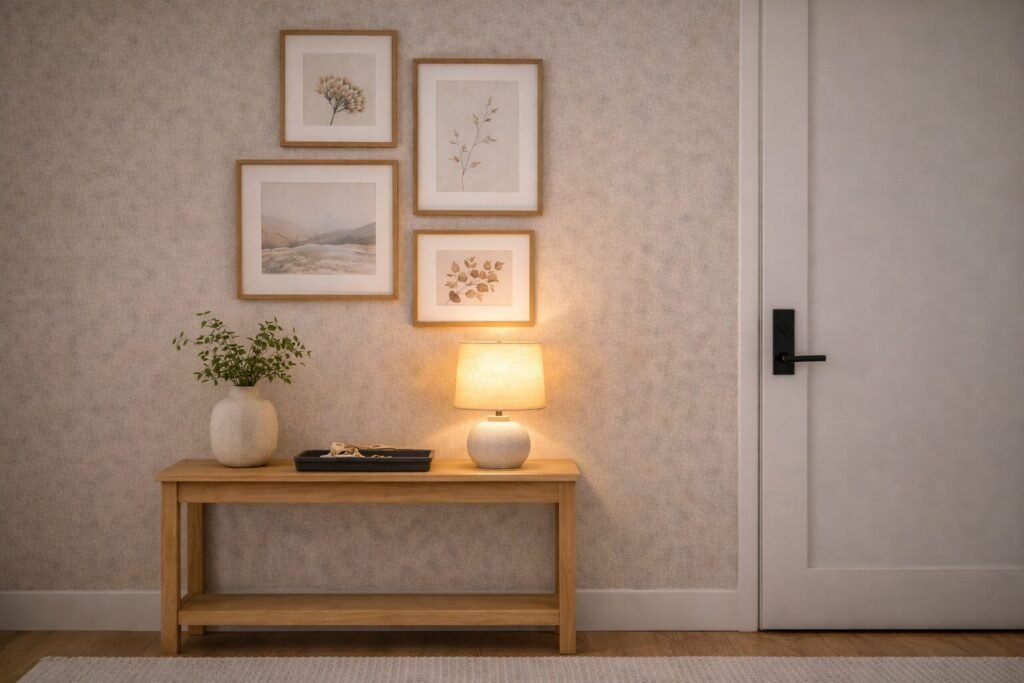
Care, Updates, and Common Mistakes
A gallery wall should evolve. Swap prints seasonally, add one new photo, or rotate a piece—especially on an entry corner wall where you see it every day. The key is keeping your core spacing and frame finishes consistent.
Quick decision
- Best for: Keeping your wall fresh without rehanging everything.
- Avoid if: You want a set-it-and-forget-it wall (choose a fixed frame set and stick to it).
- Size check: If you add pieces, expand outward evenly—don’t “drift” only to one side.
Most common mistakes (and quick fixes):
- Too scattered: Tighten spacing; treat it as one grouped shape.
- Too matchy: Add one contrast piece (texture art or a small mirror) while keeping the palette consistent.
- Crooked over time: Add bumpers; use two hooks for larger frames.
Shop links (Amazon search)
Anchor product slots (placeholders)
- Budget: Frame bumpers + glass cleaner (budget anchor) (frame bumpers + basic cleaner)
- Best overall: Frame care kit with bumpers + microfiber (best overall anchor) (bumpers + microfiber + touch-up tools)
- Premium: Small accent mirror for gallery wall (premium anchor) (upgrade: small accent mirror or elevated frame refresh)
Bundle add-on: If your entry corner needs a “landing zone,” pair the gallery with an entryway catchall tray.
Style matcher
- Modern: Keep it edited—rotate art, not more frames.
- Warm Modern: Add one tactile print (linen texture or soft abstract) for warmth.
- Luxury Modern: Swap in a high-contrast photo or add a small metallic accent piece.
Shop by Room/Zone
Reading nook corner
Window/curtain wall
TV wall + media console
Shop by Constraint
Renters (low damage)
Kids / high-traffic
Amazon Shopping Links & Anchor Picks
Mandatory links (as provided)
Place these wherever they fit best in your edit flow; tag rules applied as a placeholder:
Frames & art (search links)
Hanging tools & hardware (search links)
Cart-building add-ons (search links)
Anchor product placeholders (swap in your picks)
How We Choose These Picks
- We prioritize easy-to-use basics (frames, hardware, tools) that support clean spacing and straight hangs.
- We look for options that fit common sizes (8×10, 11×14, 16×20, 24×36) so you can build a cohesive set.
- We include renter-friendly paths alongside anchored hardware options.
- We favor finishes that work across modern, warm modern, and luxury modern rooms.
FAQ
How do I choose the right frames for my gallery wall?
Pick one main finish (matte black or light oak) and keep mat openings consistent. If you want variety, vary sizes—not finishes. Use 2–3 frame sizes for a calmer, more cohesive wall.
How much space should be between frames?
For most gallery walls, 2–3 inches between frames looks clean and intentional. Go slightly wider (up to about 4 inches) if your pieces are large and airy.
What’s the best height to hang a gallery wall?
A helpful default is to keep the visual center of the overall grouping near eye level. Above furniture, keep the lowest row a few inches above the top of the furniture so it feels connected but not crowded.
What’s the best renter-friendly way to hang art?
Use removable hanging strips for lighter frames and keep pieces smaller to reduce stress on the adhesive. If you’re using heavier frames, choose wall-rated hardware and follow the weight guidance for your wall type.
Can I add items besides framed art?
Yes. A small mirror, a sculptural object, or one textured piece can add depth. Keep the overall palette consistent so the wall still reads as one cohesive feature.